top of page
MusicMate
Discover More Music
Music Mate is a project that was done during the Design 101 course at Designlab. The purpose of the course was to give an introduction to design, teach UX/UI skills and designing tools.
The Problem
Create a music app that helps users discover more music.
.png)
Brainstorming/Empathize
I started by researching music players that are out in the market (iOS/Spotify) to see what they offered to solve this problem. Then, I came up with a point of view and 'How Might We Questions', to figure out what requirements the user has that need to be fulfilled.
Competitor Analysis


Point of View Statement
Ron is a 30-year-old doctor who loves listening to all kinds of music but because of his busy and hectic schedule, he never has the time to pause and discover any kind of new music so he ends up listening to the same content over and over again.
How Might We Questions
1. How might we help Ron discover more music without him going through endless content to save him time?
2. How might we help Ron to discover new genres, artists, and songs to meet his broad interests in music?
The POV and HMW really helped me narrow down my focus on what the problem was and what the solution needs to be. This led the next step - ideating.
Ideating through Mind Mapping

Once I knew what the problem was I knew that I was not going to redesign the entire app or replace any of the features that were already offered by the competitors. Being able to browse through all of the content is a great feature. It gives the user access to everything that is out there. It is great for someone who has the time to sit and discover music this way, but what about someone that doesn't have that time? My solution was, to add features to the app instead of replacing them. I knew right away that recommending new songs, artists, and genres based on what the user already listened to would be a good solution. The assignment was to design a minimum of three screens for a music player. I chose the screens Music Player, Playlist screen, and Recommendation screen. Then I brainstormed an idea on how the user can discover music without recommendation but also not going through endless content. I came up with an idea of an assistant that you can give commands to. The idea was similar to Siri and Google's Assistant.
The mind map allowed me to brainstorm freely and allowed me to get all of my ideas out of my head and on to a sheet of paper. A mind map gives great direction on what the next focused steps of the project will be.
Design

I began the design process by sketching a low-fi version of the app. Since I was designing the app for the iOS platform, this process allowed me to dive deeper into what the requirements are for iOS. It allowed me to ask questions like, what will my icons look like? What is the standard navigation menu look like on iOS apps? How many options are allowed in the navigation to make sure the user is not overwhelmed? What images will I use? and What kind of CTAs will I need?
Even though I was at the design I continued to as much research as possible at each stage to better help design the app. Doing research early on saves a lot of time later because you are not constantly having to change things around because of the discoveries you make.
The next step was to get into more detail about what the app will need (Logo, Images, Icons, and Style Tile).
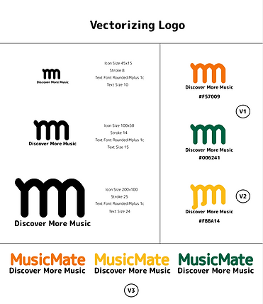
Logo

.png)
.png)
Since I had never created a logo before, I had to do research on how to come up with a good logo. One thing that stood out to me was that logos should be as minimal as possible. The purpose of a logo is to make the brand recognizable. The user should be able to see the logo and instantly recognize the brand. In order to achieve this, I made the logo very minimal so that the user does not have to spend too much time thinking about what the logo is and what it represents.
Icons
Creating an icon set was not as much of a challenge since all music apps have similar icons. One thing I have learned is that If most of the apps are using a similar pattern in their icons then it is best practice to follow that pattern so it is easy for the user to familiarize themselves with your app without having to learn new things.
Images

The next step was to gather images that created a mood for the app. Naturally, people listen to music because it makes them feel good. So my mission for this assignment was to gather images that portrayed a happy and feel-good vibe along with discovery. Having chosen the right images, logos, and icons, it led to the next step of creating a style tile.
Style Tile
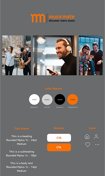
Having everything together finalized what the design would look like. The next steps in the process were to create a Hi-Fi wireframe and then the final design.
Hi-Fi Wireframe
.png)
To create the wireframes I referred back to the initial sketch and the iOS music player app to make sure I was including all of the features and also to make sure I was following the iOS standard for creating an app for the platform.
Final Design
.png)
While creating the final design I realized that some of the features that were in the wireframe would not be designable due to space constraints. To figure out this issue I did an analysis of all of the features to see which were top priority and which were low priority. In the music player wireframe, I included the image of the artist next to the song that was playing so the users can easily learn who the artist was instead of just reading a name. They can put a face to the name. Even though this was a very valuable feature, it was not as valuable as having the rest of the information about the song being played. I ended up removing that feature.
In the Recommendations screen, I initially had put data bars in the wireframe to visually represent what the user was listening to. The idea behind this concept is that if a user is being recommended something, it is good practice to tell the user WHY they are being recommended something. The user is more likely to accept the recommendation than not.
Having the data bars helped the user visually understand the data but it also took focus away from the actual recommendation. So instead of putting the bars I just put numbers that still gave the user useful data and also kept the focus on the recommendations.
After a few iterations, the design was final.
bottom of page